Set up a chart
The range sets how much time to show; the interval sets how points are grouped.
How to use it
- Choose a range above the chart or a specific date in the calendar.
- Choose a daily, weekly or monthly interval. Use an available smaller interval for more detail.
- Switch between straight lines, smooth lines and bars. Hover over a point to see its date and value.
Advice and practical context
Range and interval
The range sets the question; the interval sets detail. Monthly aggregation smooths brief incidents and peaks, while daily points expose them but carry more noise. Changing line style alters presentation rather than source values, so the conclusion should survive a visual-mode switch.
Avoid fitting the view
A rise may appear in a seven-day average but disappear in daily data because of one peak. Show both and explain the difference. Do not keep changing the range after viewing results until the chart supports the preferred story.
A calendar date and rolling range can include different points. Hover over the line's start and end and record the actual boundaries before saving a conclusion. Smoothed lines help show direction, but peaks and drops should be verified on the unsmoothed view.
Technical detailsCalculations, permissions and behavior
Chart tools
- Independent chart settings
Period, calendar day, interval, breakdown, style, lines and Per player mode belong to each chart separately. For example, view D1 over 7 days and D7 over 30 days. Changing one chart leaves its neighbors unchanged; saved choices belong to that game and chart.
The 3 days button selects the last 72 hours. Refresh requests the selected period; unavailable source data remains missing.
- Milestones
The shared button beside chart styles opens milestone types: enable all or hide individual kinds. Values and grey comparison bands remain unchanged. On charts without recorded milestones, the button is disabled and explains why.
Product charts also offer Price with its own right axis.
- Auto / interval
Auto chooses an interval from available history. Hour views use five-minute observations where available. A daily metric cannot become minute-level data.
- Breakdown
Splits the current chart into lines by acquisition source, country, platform and other supported dimensions. The selector is inside the chart; a separate chart for the same metric is unnecessary. See the breakdown dictionary below.
- Line / smooth / bars
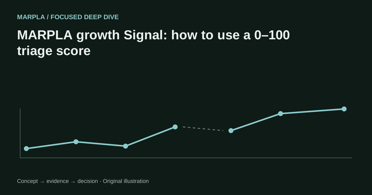
Change presentation only. Smoothing adds no measurements. A line may connect known points across a gap, but there are no measurements inside that gap.
- Legend
Click to hide or restore a line; double-click to isolate it. With more than ten individual lines, All and the top 10 for the selected period appear first; the rest are collapsed with Enable all and Disable all controls. All lines start disabled; explicit choices persist where personal chart settings are available.
All uses a confirmed overall series. For ad spend it sums saved costs from the same day with stated coverage; rates and overlapping audiences are never summed. A missing overall series receives no invented values.
- Full range fitted to width
The full selected range always fits the chart width. Date labels and vertical guides adapt automatically to screen width, while exact timestamps for every observation remain available in tooltips. The chart keeps only its useful display controls and the standard sync button at the bottom right.
Personal button order
Drag metric, range, interval and breakdown buttons to reorder them. With the keyboard, press Alt + ← / → on a focused button. Your MARPLA account stores the order and restores it on your next sign-in, including on another device.
Teammates have independent settings. Without sign-in, ordering lasts only for the current session. A failed save is explained on the buttons and retried automatically.
History, gaps & performance
Pages read stored MARPLA data. Collection and retries extend the archive when sources supply new values. Current CCU cannot reconstruct history before observations began.
Missing values are not filled with zeros. Market history is limited to 2,000 intervals per request; long charts also reduce rendered points while preserving endpoints and extrema. Narrow the range for detail.
Tooltips show timestamps and time zones.
More than ten lines
Products, product groups, campaigns, languages and other charts with more than ten individual lines use All, the top 10 and collapsed Others. All lines start disabled. Within Others, enable individual lines or the entire group; this does not enable All or the top 10.
Ranking uses saved values from the selected period independently of visibility. Changing the period preserves explicit choices. All does not sum rates or unique users across segments; missing confirmed totals remain gaps.
Saved campaign costs are summed within the same Europe/Lisbon report date and can have partial coverage.
Useful articles: examples and decisions
The guide covers the steps in the service. These articles explain the metrics, examples, techniques and how to evaluate results.

Compare Roblox games on the same evidence
Place selected experiences on shared charts and separate real differences from timing and coverage artifacts.
Read article →
Observed CCU history for Roblox games
Inspect saved concurrent-player samples with honest gaps, timestamps and range controls.
Read article →
CCU, Visits, and growth: what the numbers actually say
Understand Roblox audience metrics without confusing a live snapshot, a lifetime counter, and a measured trend.
Read article →